Monday, March 27, 2017

Feedback

What was the most compelling/surprising/interesting/useful concept I learned in CSC318? Why?

  The most useful concepts I learned from this course is the heuristic evaluation. From the heuristic evaluation, I learned a standard to evaluate a website/application. And I could design the graphic user interface of a website/application according to 10 heuristics.

I had a chance to put into practice a concept from the course. Here is my experience.

  In the assignment 2, my partner and I conducted the heuristic evaluation on MarkUs website. During this process, we developed a deeper understanding of what a good user interface should be and how to improve the user experience.

Sunday, March 19, 2017

Functional animation in UX design

  • What is functional animation


            The functional animation is a technic used by designers to help users to understand the logic behind the user interface. A well-designed functional animation could greatly improve user experience by reducing users' cognitive load. One of the most well-known examples is the loading animation. The loading effect indicates the status of a system. This could provide a positive feedback to users after they requested some resources from the system. This could also reduce the negative emotions raised by the waiting. 

Loading effect example

  • What makes a good functional animation?

          1. Responsiveness

          Similar to the criteria of other UI/UX designs, a functional animation is supposed to appear immediately after a user's operation. It is a common feature that people are always looking for feedbacks after an operation to learn the functionality. A good functional animation should satisfy users' desire.
The animation is responding to user's clicking

        2. Correlation
            A functional animation should always closely related to its trigger. For example, if clicking a button in the page could show a menu on the same page, the location of the menu should be around the button. Otherwise, users would be confused about the relation between the button and the menu.
A good example from Google material design

         3. Being natural
             A functional animation should follow the basic physics rules. Designers should consider the gravity and friction in their animations.
A user wanna check the details
       From the gif above, we could see the process of the animation is begin->accelerating->decelerating->stop. This process is natural and predictable.

         4. With purpose
        There should be a proper purpose for using the animation. Designers should avoid using pointless animations. 
User clicks an item in a calendar
           In the above gif, clicking an item in a calendar triggers an animation to show the details of the item. The animation used in this scenario could help users to understand the relation between the item and the popup. 
        5. Fastness
            A well-designed functional animation should avoid making users waiting for the animation finish. A long and tedious animation could greatly reduce user experience.
  Good example                                 Wrong example

References

1. https://www.smashingmagazine.com/2015/05/functional-ux-design-animations/
2. http://mp.weixin.qq.com/s?__biz=MzAwNzc5NjgxMg==&mid=2651802272&idx=1&sn=03e7f232bb0a1e67b0f6d41a521e832f&chksm=80834b83b7f4c2959dc611053d0c8b3d87adce052236ceb2d6d9ac543975a78c3dc461c758e5&mpshare=1&scene=23&srcid=0319b4qeWRtAgtI9vv0XLKEN#rd
3. The gifs are collected from material design.


Thursday, March 2, 2017

Case study-WeChat short video recording

  Wechat is a popular instant message app supporting multiple platforms. Several months ago, Wechat group added a short video recording function to its application. Users could record and send a short(several seconds) video to their friends. 
  There were two ways to start recording a short video.
  • Pulling down the Moments page, an eye sign appears. Releasing the Moments page, the short video recording panel appears.

The eye sign appears after pulling down the page[1]
  • Clicking the Camera icon on the right top corner, then selecting "Use Camera" from the menu.

  However, in the recent update of Wechat application. They removed the pulling down to record short video function because this function broke the heuristic of consistency and standards. Users are used to pulling down to refresh a page. The original design, pulling down to start recording is violating the habit of most people. The stats indicated that more than 90% users are using the second way to record a short video even the second method takes more steps.
  From this example, we could conclude that users prefer the designs that obey their intuition.

References
  1.http://img14.3lian.com/201511/30/7964826d34379b680d22af9dd052a99d.jpg
  2.http://www.3lian.com/edu/2015/11-30/261321.html

Sunday, February 19, 2017

Gamification and military training

  Gamification is a technology applying game-related concepts to non-game contexts. A well-designed gamification application could greatly boost the productivity of players involving in this application. Although gamification can be used in various areas, we would only focus on the military training application in this article. 
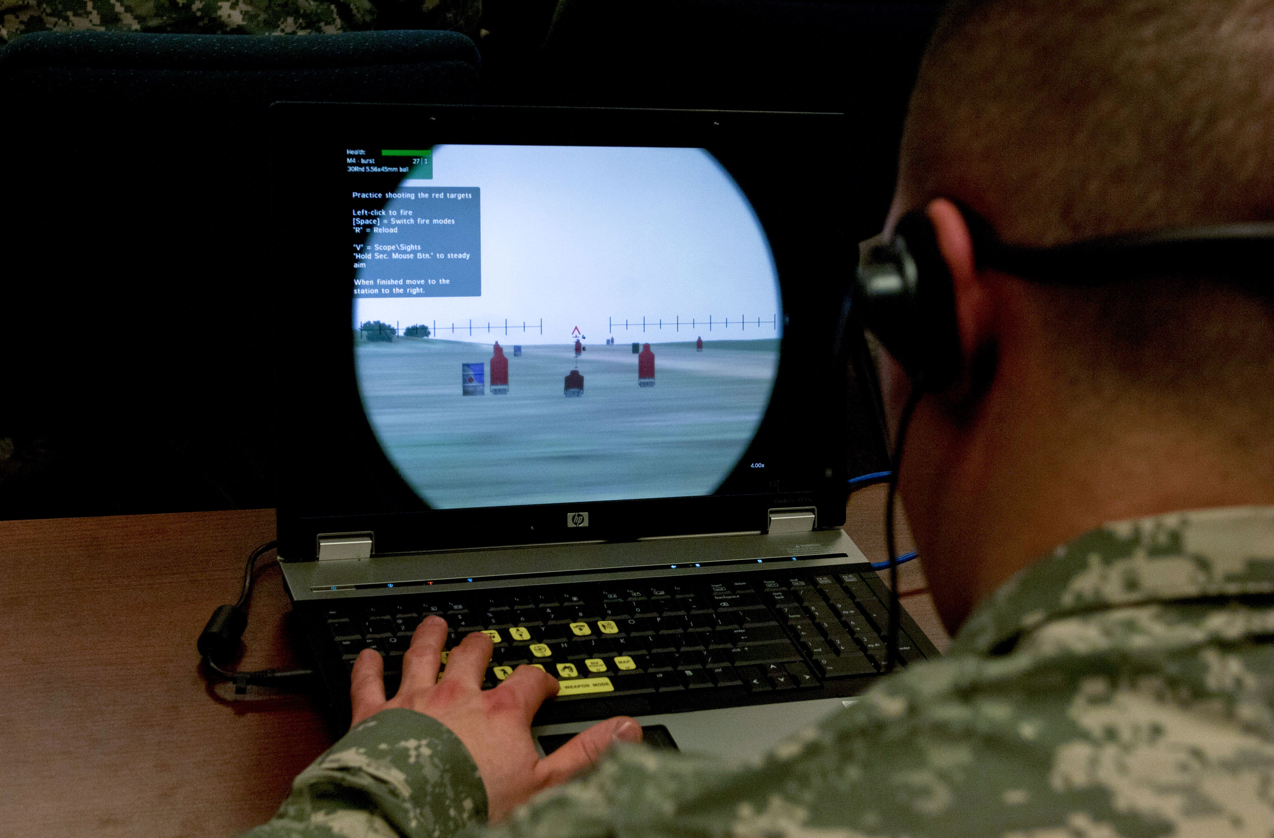
   Military training is a key process or army. Commonly soldiers need to learn how to operate military equipment and perform tactical strategies in battlefields. However, it is extremely difficult and expensive to simulate a battlefield in the real world for training purpose. And soldiers are bearing the risk of being injured in such simulated battlefield. Consequently, using a game to simulate a battlefield is one of the best options for armies.
    VBS is a battlefield simulation game designed by Bohemia Interactive Australia. Currently, armies from many countries are using this game to train individual soldiers or small units. For example, the United States Marine Corps(USMC) used this game to enable the practice of military tactics in late 2001.
A soldier is training in a game[1]
   There are several features which make battlefields simulation games to be the best choice for the military training. First of all, video games are able to express concepts and knowledge graphically. Before using video games for training, soldiers need to learn battle tactics by reading books. Reading text is relatively tedious comparing to reading graphs. Secondly, battlefield simulation games such as VBS provide multiplayer mode. In this mode, players collaborate to complete a task. The collaboration skill can be practiced during the process. Lastly, games could completely mimic the operation of various military gears. players can gain experience from operating these virtual gears in the game and apply the knowledge learned from the game to the real equipment.

Reference
1.https://media.defense.gov/2013/Apr/02/2000062206/-1/-1/0/130311-F-FE339-036.JPG

Sunday, February 5, 2017

UI/UX analysis and suggestion for menti.com

  Mentimeter is an online polling tool. Lecturers can use this tool to interactively collect feedbacks from audiences. This product is used in one of my course. The professor uses this tool to conduct in-course quizzes. In this post, I will try to analyze the user experience of this polling tool.
  •    Index page
                         
             The index page is clean and intuitive. Users only need to input presentation code to enroll in the presentation.
  • Voting Page

      
         The question is bold and has largest font size on this page. This helps to attract attention from students. The result is presented in a bar graph with different colors. This intuitively indicates the voting result of each option. The person sign and number at the right bottom corner clearly indicates the number of votes.
           There are two minor issues with this page. Firstly the navigation signs are too small comparing to other elements on this page. One of my friend in this course did not notice the navigation signs at first. He thought there was only one question in this quiz. Secondly, there is no progress information indicating element on this page. Students are not able to know how many questions left in this quiz. This may make students lose patience while doing this quiz.

Sunday, January 22, 2017

Week1-Information architechture & User Experience

  
Information architecture
  Information architecture is a relative old term comparing to User experience. The concern of information architecture is the effective way to display information to user. Because of information explosion, how to create usable structure of information is becoming more and more important. There are two good points on designing information architecture.
  Simplicity
    Presenting information in a simple and intuitive way is always crucial. Replacing long text to simple images can instantly improve user experience. A bad example is the parking signs in Los Angeles. A small parking sign contains too much information which makes driver hard to understand.

Information overloaded parking signs vs. simplified parking sign
    The simplified parking sign in picture replaces long and tedious text to intuitive charts and tables. This greatly improves the readability of parking signs.
  Logic behind structure of information
     Designers should organize the content with logic. For example, news websites can use categories to organize content. This makes readers easier to find the news they are interested with. Online shopping website can use a tree view to classify their products.